12. Native Confirmation Dialog
Right now we're not showing a confirmation when the user presses the delete button. Let's fix that.
JS Confirm
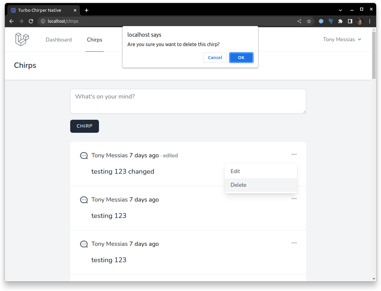
Turbo offers a data-turbo-confirm attribute we can use in forms and links. By default, that uses the JS confirm feature. Let's start with that.
First, let's update our chirps/partials/chirp.blade.php file and add the data-turbo-confirm to the delete form:
<x-turbo::frame :id="$chirp" class="block p-6">
    <div class="flex space-x-2">
        <!-- ... -->

        <div class="flex-1">
            <div class="flex justify-between items-center">
                <!-- ... -->

                @if (Auth::id() === $chirp->user->id)
                <x-dropdown align="right" width="48" data-bridge--popup-menu-msg-value="{{ $chirp->message }}">
                    <!-- ... -->

                    <x-slot name="content">
                        <a href="{{ route('chirps.edit', $chirp) }}" data-bridge--popup-menu-target="option" class="block w-full px-4 py-2 text-left text-sm leading-5 text-gray-700 hover:bg-gray-100 focus:bg-gray-100 transition duration-150 ease-in-out">
                            Edit
                        </a>

                        <!-- Update form: -->
                        <form action="{{ route('chirps.destroy', $chirp) }}" method="POST" data-turbo-confirm="{{ __('Are you sure you want to delete this chirp?') }}">
                            @method('DELETE')
                            <button data-bridge--popup-menu-target="option" class="block w-full px-4 py-2 text-left text-sm leading-5 text-gray-700 hover:bg-gray-100 focus:bg-gray-100 transition duration-150 ease-in-out">
                                Delete
                            </button>
                        </form>
                    </x-slot>
                </x-dropdown>
                @endif
            </div>

            <p class="mt-4 text-lg text-gray-900">{{ $chirp->message }}</p>
        </div>
    </div>
</x-turbo::frame>
That should get the JS confirm appearing both in the webapp and native.
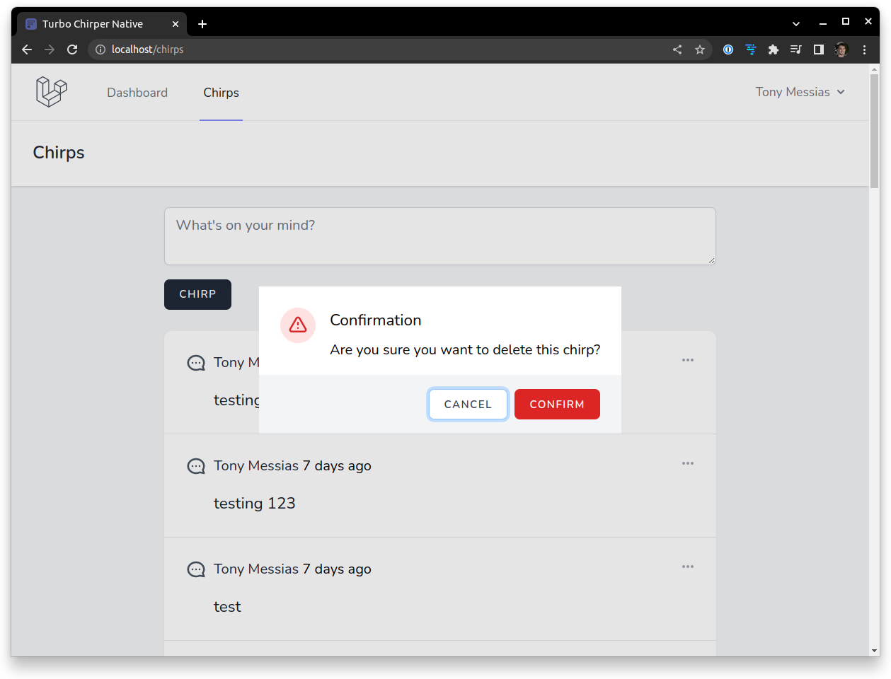
That's nice, but we can do a lot better. Let's start with the web version. Turbo allows us to override the default implementation of its confirm feature. Let's implement it using our own modal.
First, we're gonna create a global modal that will be used for this kind of confirmation. In the resources/views/layouts/app.blade.php, update it to include the modal:
<!DOCTYPE html>
<html lang="{{ str_replace('_', '-', app()->getLocale()) }}">
    <head>
    </head>
    <body class="font-sans antialiased">
        <!-- ... -->

        @include('layouts.confirmation_modal') <!-- Add this -->
    </body>
</html>
Next, let's create the resources/views/lauouts/confirmation_modal.blade.php file with the following contents:
<dialog id="confirmation_modal" class="p-0">
    <form method="dialog">
        <div class="bg-white px-4 pt-5 pb-4 sm:p-6 sm:pb-4">
            <div class="sm:flex sm:items-start">
                <div class="mx-auto shrink-0 flex items-center justify-center h-12 w-12 rounded-full bg-red-100 sm:mx-0 sm:h-10 sm:w-10">
                    <svg class="h-6 w-6 text-red-600" stroke="currentColor" fill="none" viewBox="0 0 24 24">
                        <path stroke-linecap="round" stroke-linejoin="round" stroke-width="2" d="M12 9v2m0 4h.01m-6.938 4h13.856c1.54 0 2.502-1.667 1.732-3L13.732 4c-.77-1.333-2.694-1.333-3.464 0L3.34 16c-.77 1.333.192 3 1.732 3z"/>
                    </svg>
                </div>

                <div class="mt-3 text-center sm:mt-0 sm:ml-4 sm:text-left">
                    <h3 class="text-lg" id="confirmation_title">
                        {{ __('Confirmation') }}
                    </h3>

                    <div class="mt-2" id="confirmation_message">
                        {{ __('Are you sure?') }}
                    </div>
                </div>
            </div>
        </div>

        <div class="flex flex-row space-x-2 justify-end px-6 py-4 bg-gray-100 text-right">
            <button id="confirmation_negative_btn" type="submit" value="canceled" class="inline-flex items-center px-4 py-2 bg-white border border-gray-300 rounded-md font-semibold text-xs text-gray-700 uppercase tracking-widest shadow-sm hover:text-gray-500 focus:outline-none focus:border-blue-300 focus:ring focus:ring-blue-200 active:text-gray-800 active:bg-gray-50 disabled:opacity-25 transition">
                {{ __('Cancel') }}
            </button>

            <button id="confirmation_positive_btn" type="submit" value="confirmed" class="inline-flex items-center justify-center px-4 py-2 bg-red-600 border border-transparent rounded-md font-semibold text-xs text-white uppercase tracking-widest hover:bg-red-500 focus:outline-none focus:border-red-700 focus:ring focus:ring-red-200 active:bg-red-600 disabled:opacity-25 transition">
                {{ __('Confirm') }}
            </button>
        </div>
    </form>
</dialog>
Now, let's override the default behavior to show this new modal instead of using the default JS confirm. In the resources/js/libs/turbo.js, let's use the Turbo.setConfirmMethod(), it accepts a function that returns a Promise.
import * as Turbo from '@hotwired/turbo';
import { Confirmation } from '../helpers';

Turbo.setConfirmMethod(Confirmation);

export default Turbo;
Now, let's create our Confirmation function. Create a resources/js/libs/helpers/confirmation.js file with the function defined:
import { WebConfirmation } from './web_confirmation';

export function Confirmation (message) {
    return new WebConfirmation().confirm(message);
};
Turbo will pass the message we set in the data-turbo-confirm as the first parameter and the HTML element as the second parameter. We could use it to set additional params as data-* attributes in the form itself if we wanted to, like the icon or title shown in the modal, for instance. We're not gonna use that here, so we only need the message. We're going to delegate the manipulation of the modal to a WebConfirmation class, we only need to call its confirm method passing down the message. Let's create the resources/js/libs/helpers/web_confirmation.js:
export class WebConfirmation
{
    confirm(message) {
        return new Promise((resolve) => {
            let dialog = document.querySelector('#confirmation_modal')

            dialog.querySelector('#confirmation_message').textContent = message;

            dialog.addEventListener('close', () => {
                resolve(dialog.returnValue === 'confirmed');
            }, { once: true });

            dialog.showModal();
        });
    }
}
We're querying the dialog from the DOM, setting the contents of the #confirmation_message element as the message, then we're registering an event listener for the close event, then we're calling the dialog.showModal() method. As for the Promise, Turbo only expects that we pass true or false to the resolve function to indicate if it was confirmed or not. Let's see that in action:
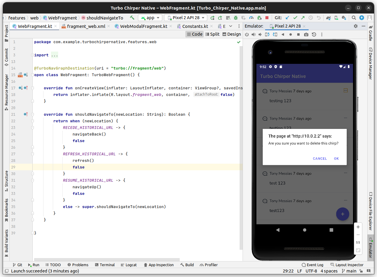
This is not so good for the native version, but the web one is nice. Let's fix that.
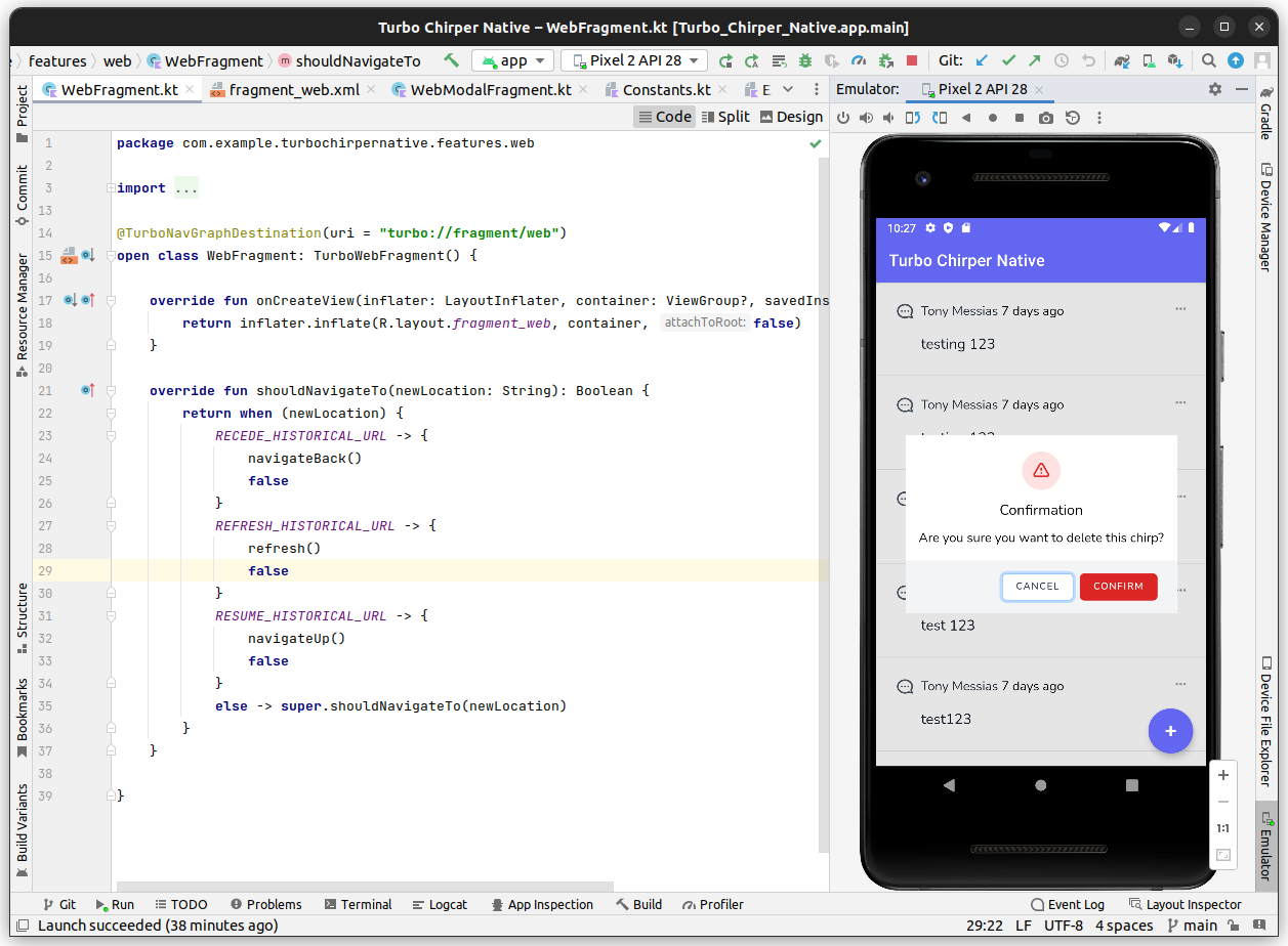
Native Confirmation
For the Native confirmation, we're gonna need to extend our Kotlin JSBridge a little bit. Whenever a confirmation is triggered by the webapp, and we're in a Hotwire Native client, we're gonna register a listener for the Native confirmation result, then send a message to the bridge and ask it to show a native AlertDialog. When the user chooses an option, we're going to send the result back to the web app via a custom event.
Let's start with the web side, since it's simpler. Change the resources/js/helpers/confirmation.js file to look like the following:
import { BridgeConfirmation } from './bridge_confirmation'; // Add this
import { WebConfirmation } from './web_confirmation';
import { isMobileApp } from './platform'; // Add this

export function Confirmation (message) {
    // Add this:
    if (isMobileApp) {
        return new BridgeConfirmation().confirm(message);
    }

    return new WebConfirmation().confirm(message);
};
Now, let's create our resources/js/helpers/bridge_confirmation.js file:
export class BridgeConfirmation
{
    confirm(message) {
        return new Promise((resolve) => {
            window.addEventListener('confirmation:handle', ({ detail }) => {
                resolve(detail === "confirmed");
            }, { once: true });

            window.NativeBridge.showConfirmationModal(message);
        });
    }
}
It's really simple, right? Registering the event listener and sending a showConfirmationModal message to the bridge.
Now, let's update the MainSessionNavHostFragment.kt in the native side to accept that message:
package com.example.turbochirpernative.main
// ...
import android.content.DialogInterface
import androidx.appcompat.app.AlertDialog
class MainSessionNavHostFragment : TurboSessionNavHostFragment(), PopupMenuDelegator {
// ...
override fun showToast(msg: String) {
activity?.runOnUiThread {
Toast
.makeText(requireContext(), msg, Toast.LENGTH_SHORT)
.show()
}
}
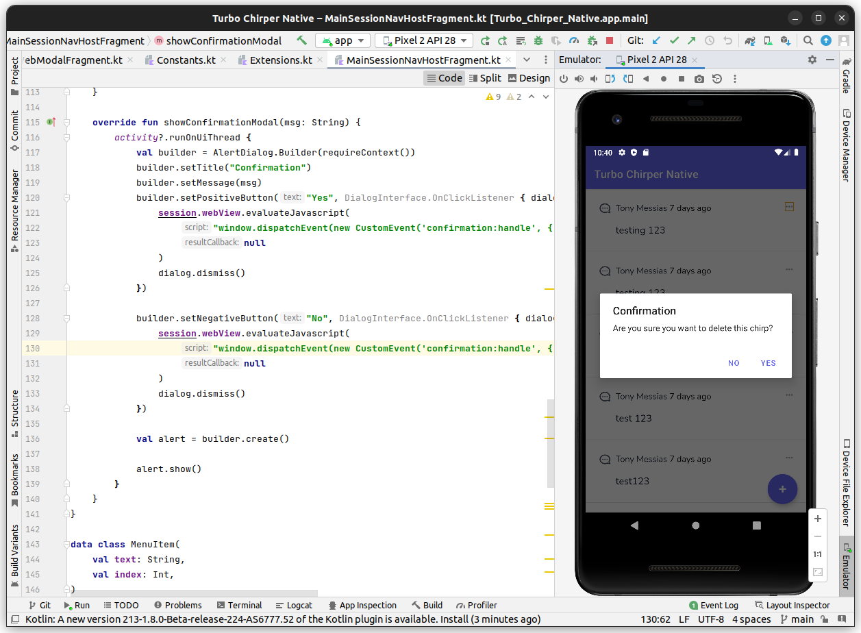
override fun showConfirmationModal(msg: String) {
activity?.runOnUiThread {
val builder = AlertDialog.Builder(requireContext())
builder.setTitle("Confirmation")
builder.setMessage(msg)
builder.setPositiveButton("Yes", DialogInterface.OnClickListener { dialog, id ->
session.webView.evaluateJavascript(
"window.dispatchEvent(new CustomEvent('confirmation:handle', { detail: 'confirmed' }))",
null
)
dialog.dismiss()
})
builder.setNegativeButton("No", DialogInterface.OnClickListener { dialog, id ->
session.webView.evaluateJavascript(
"window.dispatchEvent(new CustomEvent('confirmation:handle', { detail: 'canceled' }))",
null
)
dialog.dismiss()
})
val alert = builder.create()
alert.show()
}
}
}
// ...
interface PopupMenuDelegator {
// ...
fun showConfirmationModal(msg: String);
}
class JsBridge(private var delegator: PopupMenuDelegator) {
// ...
@JavascriptInterface
fun showConfirmationModal(msg: String) {
delegator.showConfirmationModal(msg)
}
}
Testing It Out
This should get our native confirmation modal looking similar to our JS confirm one, but now we're in full control of it looks like and what it does: